Spoiler alert – this hand lettering tutorial is totally written for names, but can be adapted to any other word.
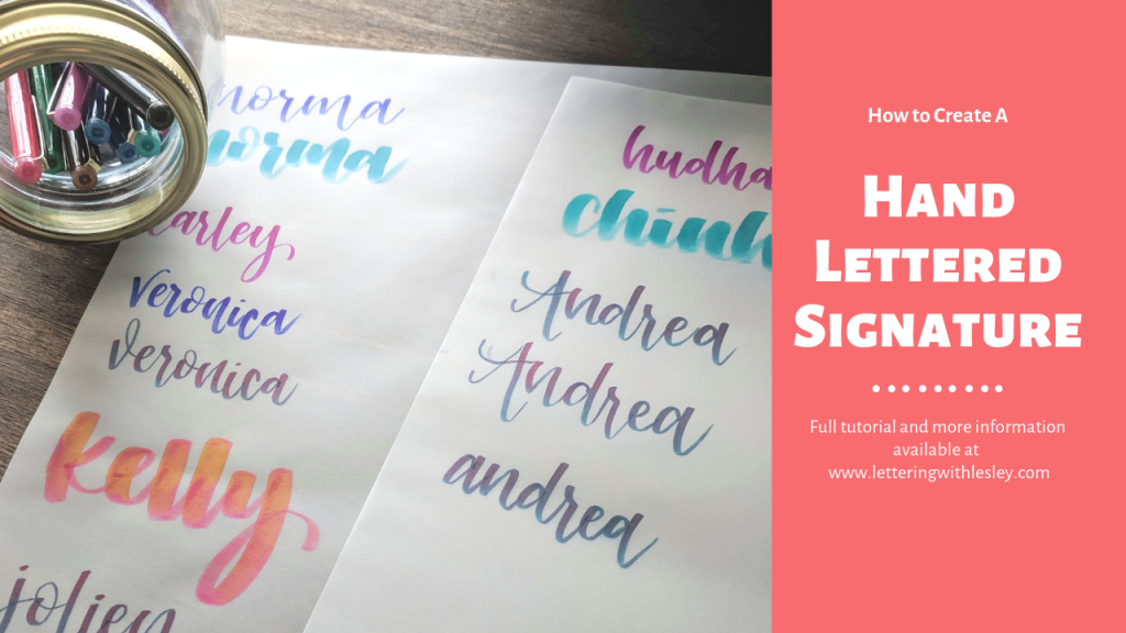
A few weeks ago, I tossed out a question to my lettering group (they are awesome and we would love to have you join us!) – what do you want to learn and know about hand lettering? I got lots of good information and hopefully you will see lots of great lessons on my blog for the next few months. So, after a small amount of personal debate, our first tutorial up is how to create a beautiful hand lettered signature!
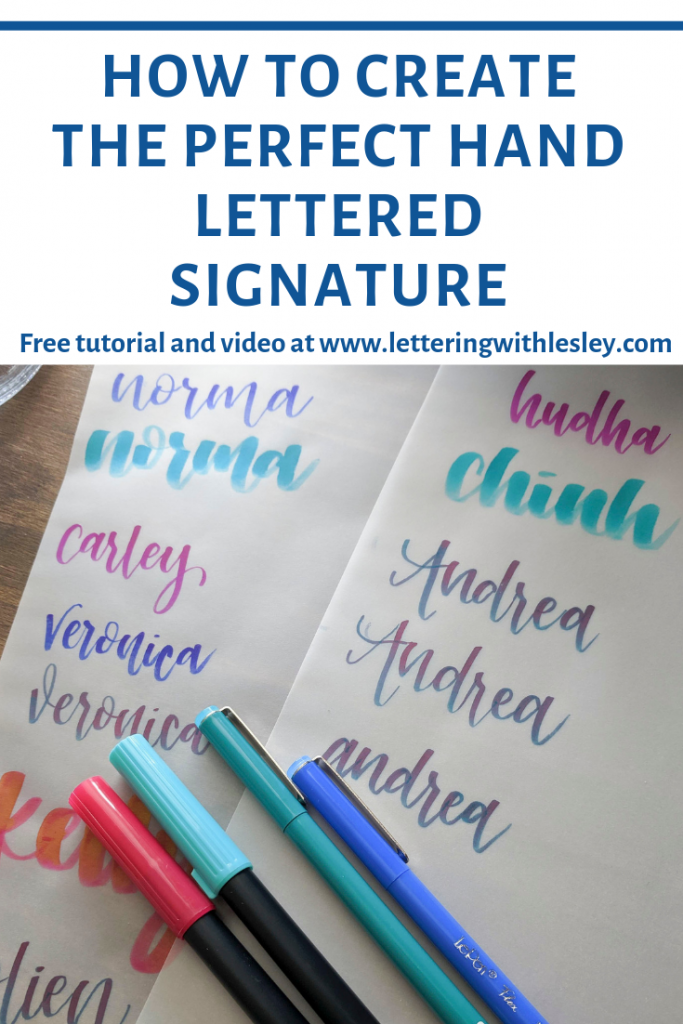
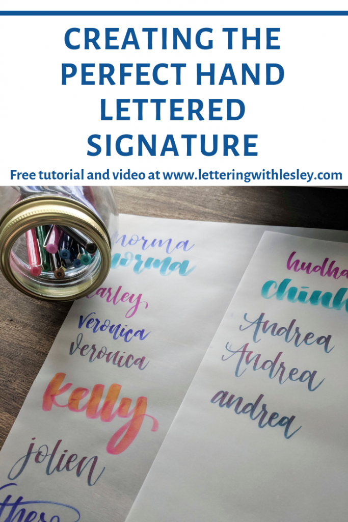
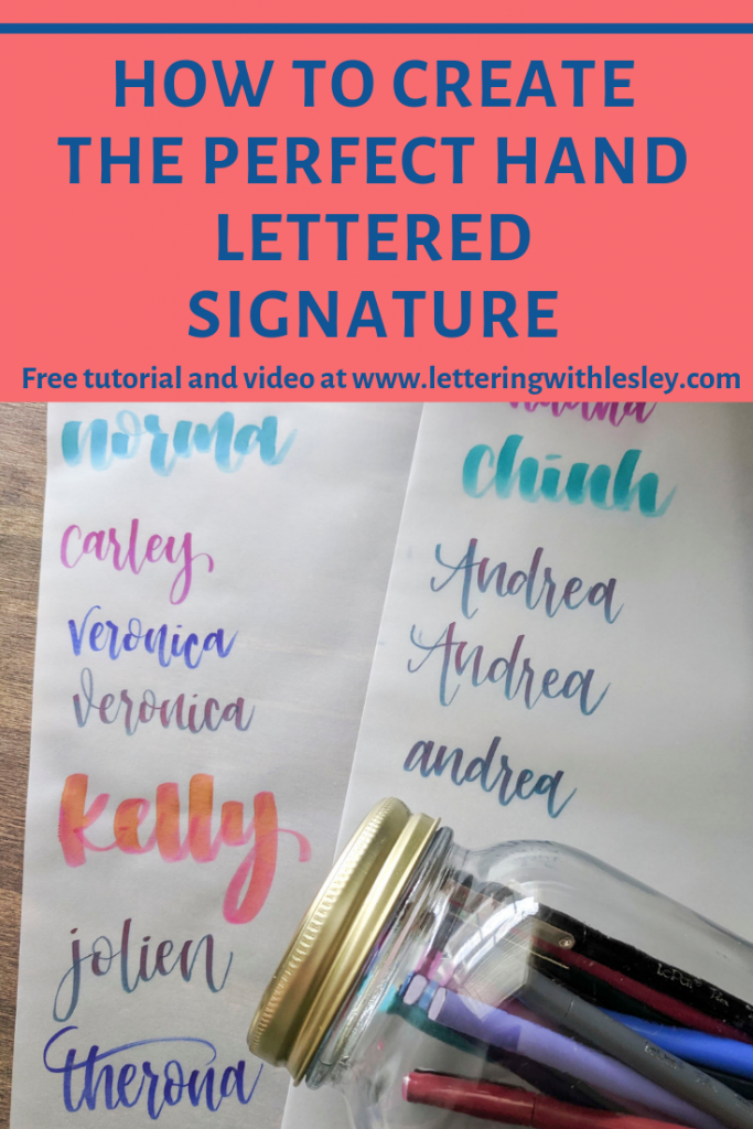
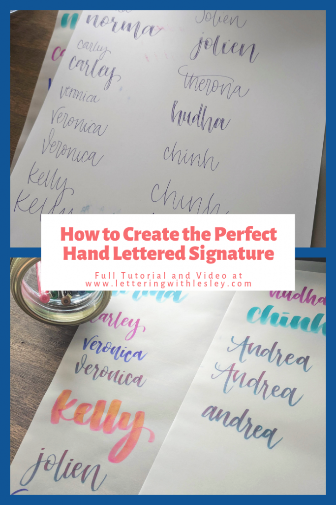
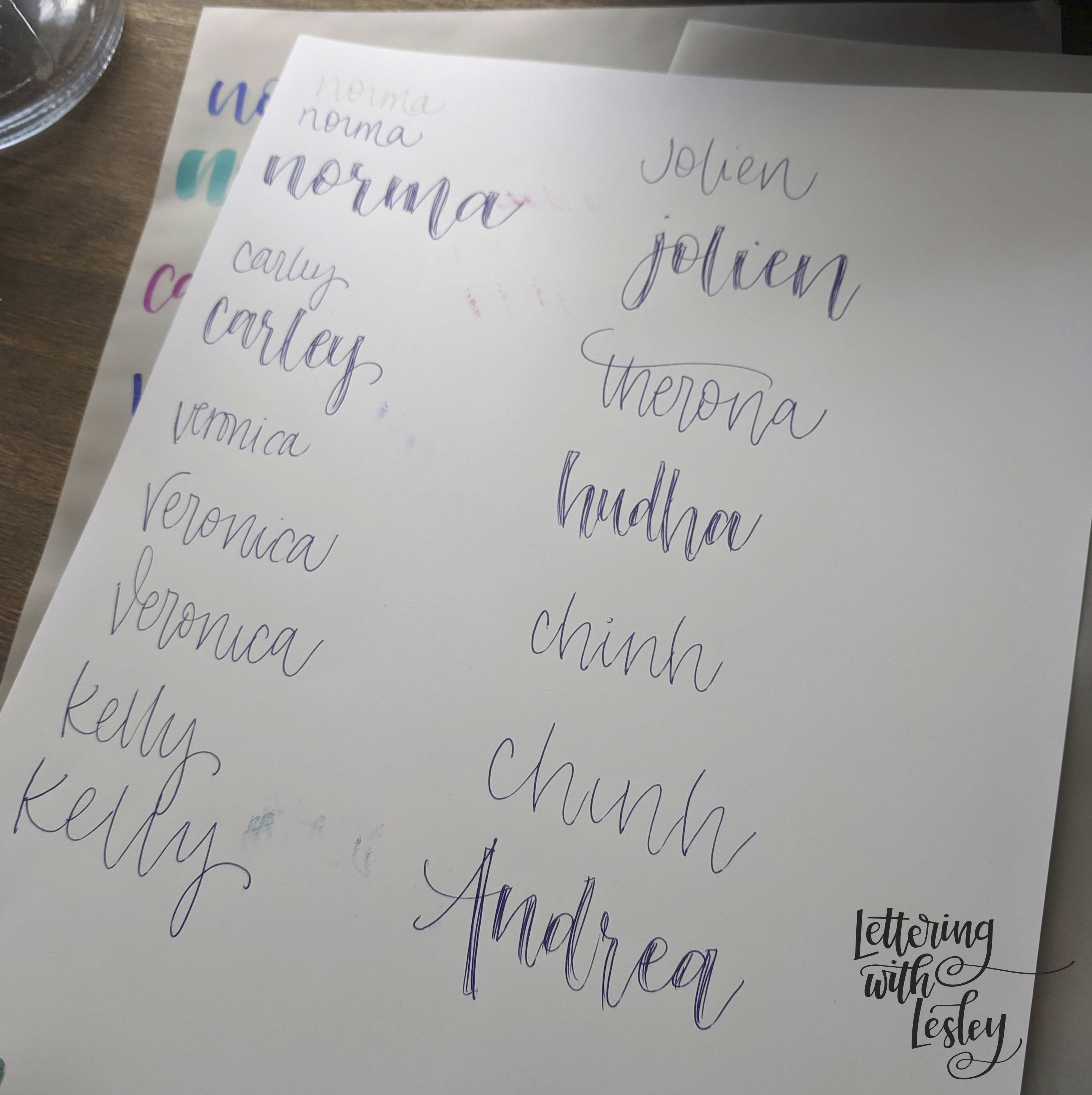
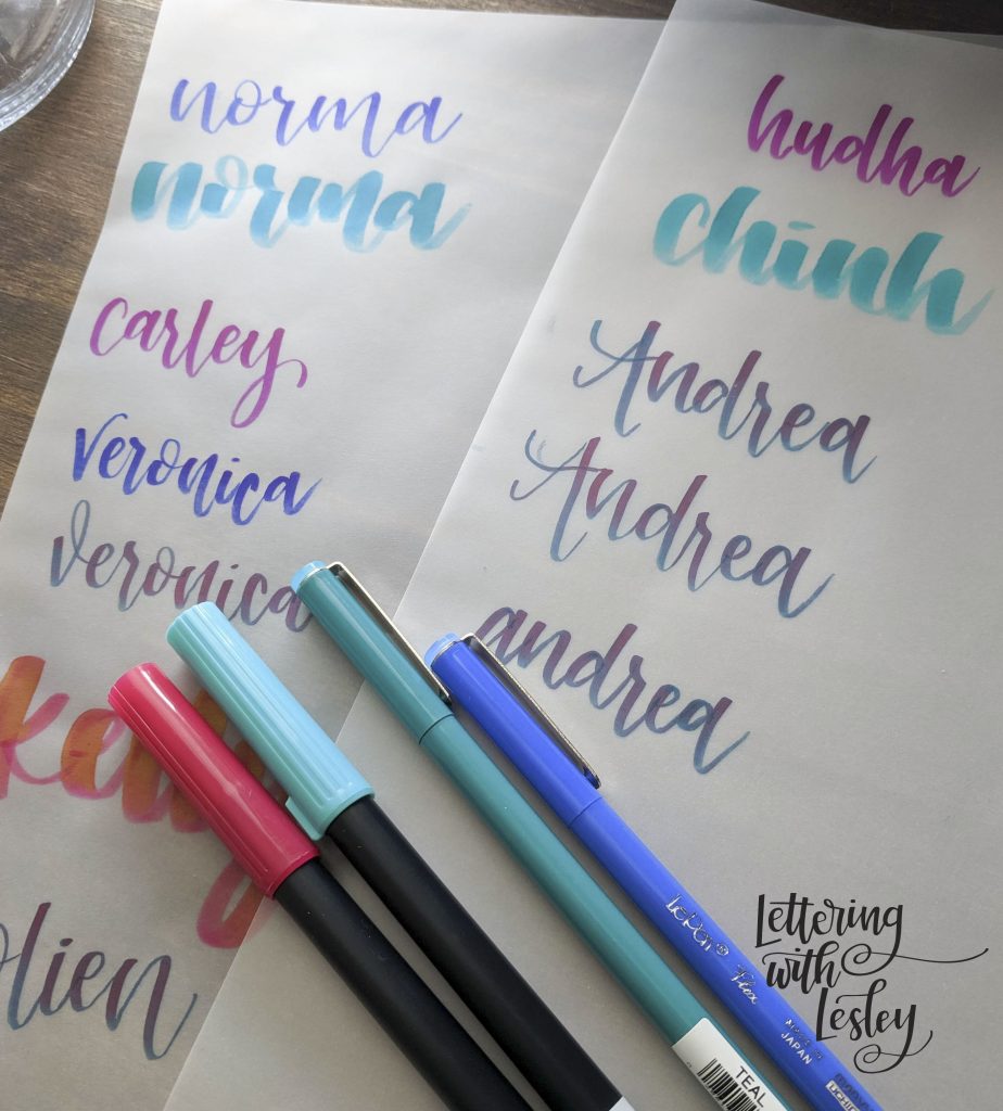
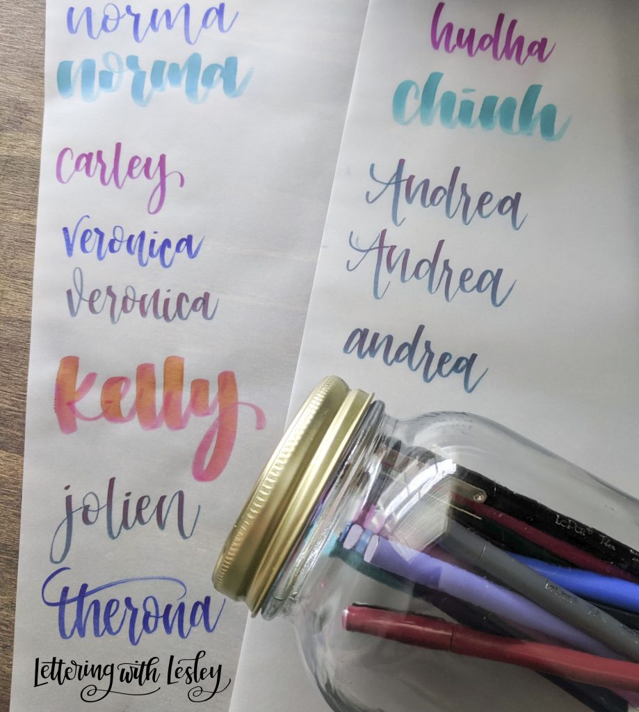
In my classes, I always create a little hand lettered place cards and people are excited to see their name. I get excited when I see other artists letter my name. Isn’t it funny how something so small can seem like such a big deal? And my name looking cute on some mail – yes please! It makes letters so much better!
One of my number one custom orders is personalized stationary with names of clients or client’s kids (both with and without fur). There is nothing like seeing a card with someone’s name written special right across the front. Today, I wanted to share a few tips and tricks to create your perfect hand lettered signature. Before I get started, let me give this disclaimer. While my writing looks like this while I letter, it surely doesn’t while I am signing a credit card receipt or writing my grocery list. This style takes a little time to develop and practice. These steps will certainly get you on your way to creating beautiful signatures!
STEP 1:
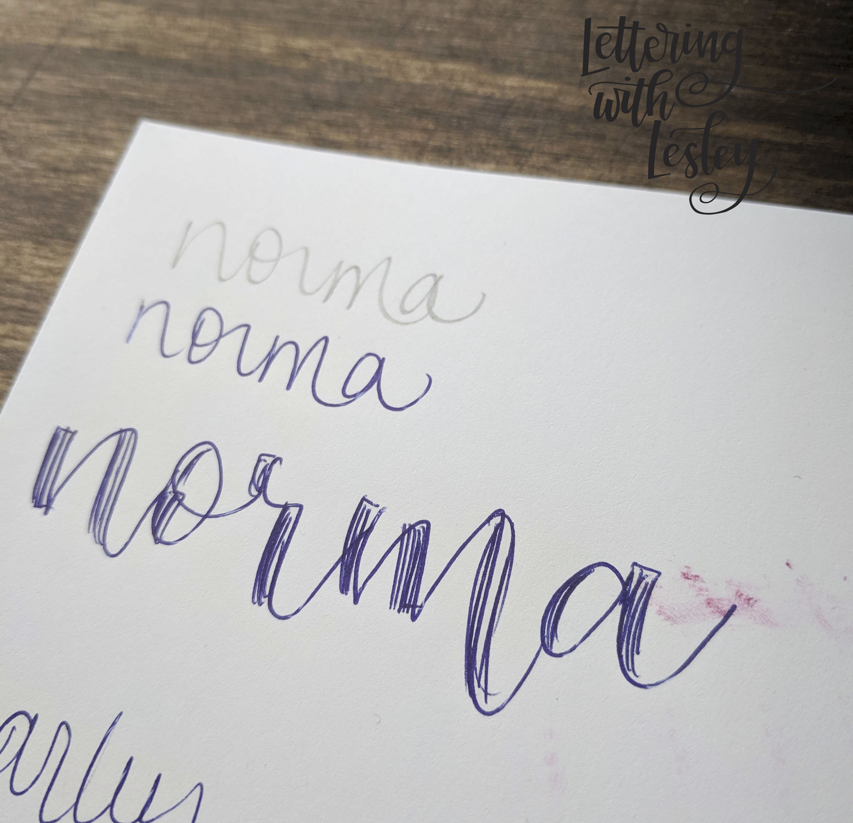
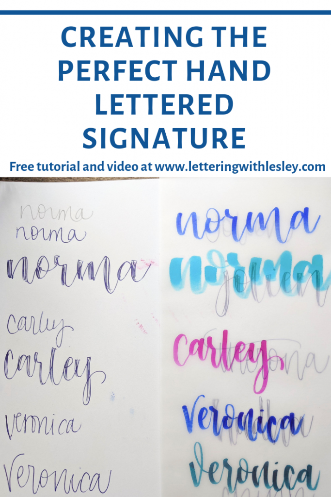
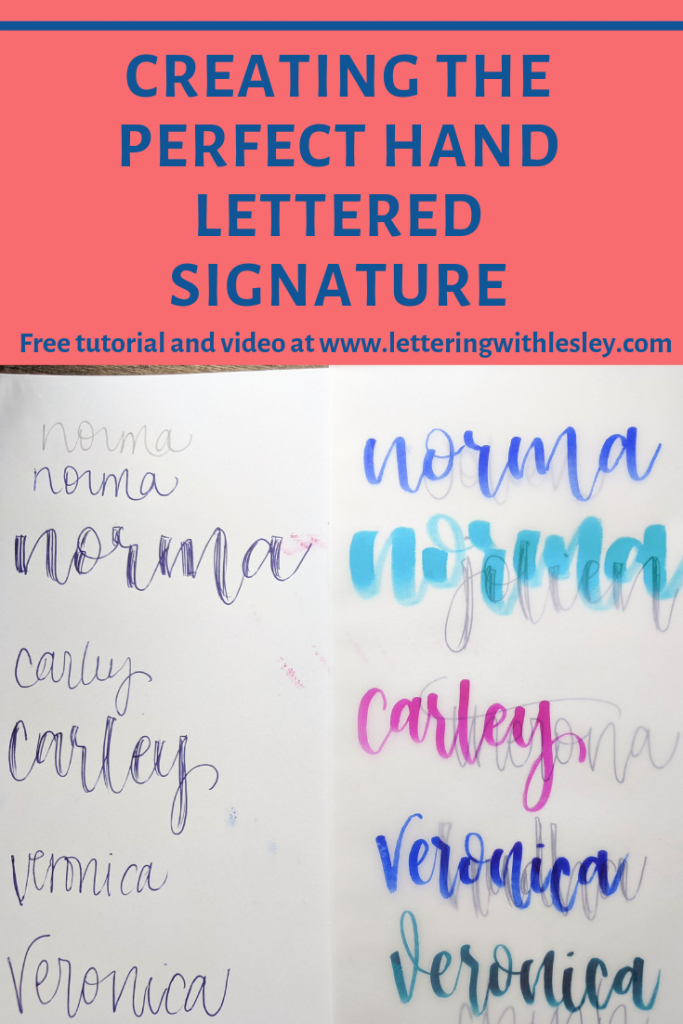
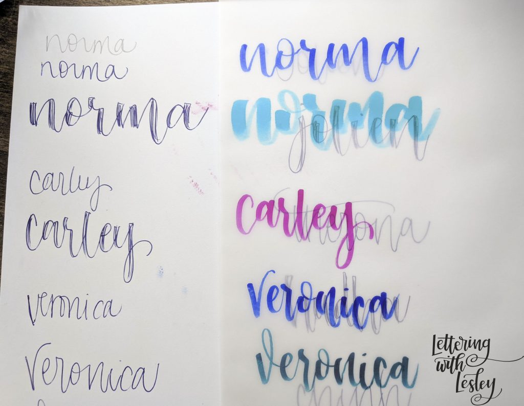
Let’s start by writing your name in your regular cursive or cursive-ish writing using a regular pen or pencil. This gives us a good starting place to look at how you form your letters. The biggest different between hand lettering and regular writing is the intentionality between the structure and spacing of the letters. Let’s ask ourselves these questions:
- Are your letters really tiny or really large? Both will probably need to be adjusted, but especially little letters. You have to give yourself room to write with a fat pen.
- Are your letters really close together? Is one letter touching another or do they have a little space between them? Is this spacing consistent throughout your name?
- Are there some that are illegible (I’m looking at me here!)? Legibility is key!
- Do they have teeny tiny spaces in the middle of them? For this question, I am thinking specifically about the letters: a, b, d, e, g, o, p, q, w, y. If they get all squished up, it will be really hard to tell what is what when you add thickness.
STEP 2:
Write it bigger! We need to address some of these issues to make sure we have enough spaces for our thick and thin lines. I recommend writing one letter at a time and picking up your pencil between each letter. It is a really weird habit to break, but it keeps you from falling back into your cursive habits. This also helps you focus on giving yourself plenty of space. Write each letter a little bit wider than you usually would.
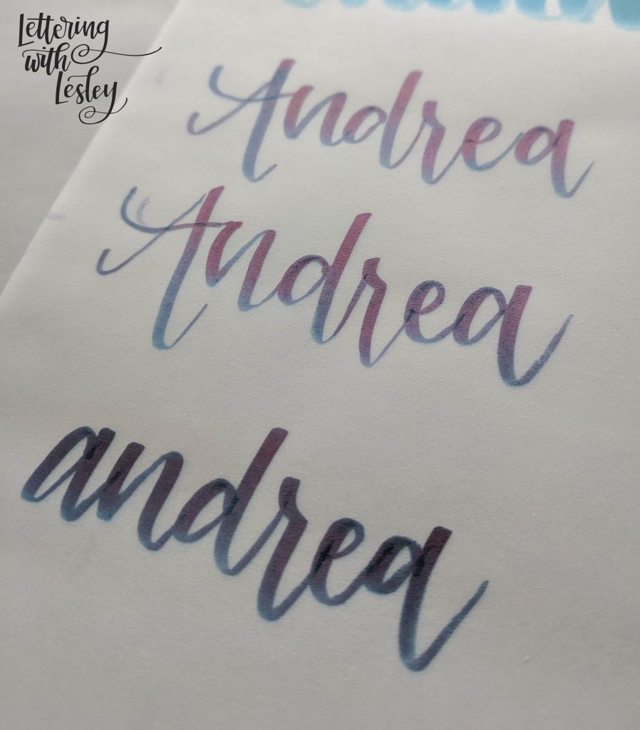
This is also a great time to work on adding in any flair or personal touches to your letters. The great part of hand lettering – especially when writing your signature – is that it is yours! So, think about making something happen that mirrors your “real writing”. I love the little flip up in the V in Veronica or adding a giant cross bar or big loopy flourish on the tail of your down strokes.
STEP 3:
Faux-lligraphy baby! So, before we even hit the brush pens, we are going to add the thickness in with our pencils. That helps us know where to add pressure – I find this especially helpful for new letterers. It can be really challenging to know where those downstrokes go when you first start lettering.
So, for this part, you can add a little thickness every time you move your pencil downwards. Even if it is just a little bit, you want to add a little extra. This is what gives it the hand lettered look that you are after!
(If you are a brand new letterer, I highly recommend that you start with a beginning lettering lesson first! It will help and I will shamelessly plug mine right here!)
STEP 4:
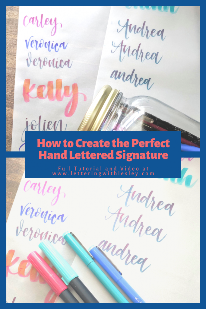
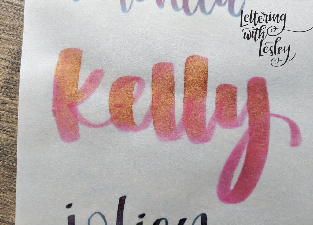
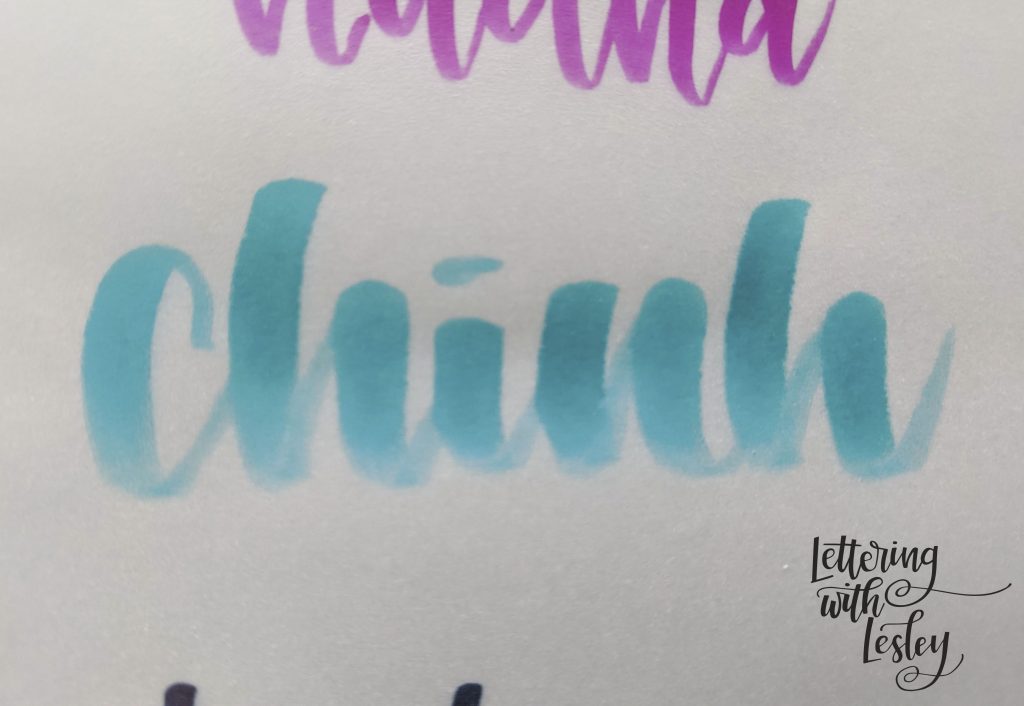
Grab the brush pens! For most people, a small to medium sized pen is going to be the right size for what your hand writing is. If you want to use a large pen, there are more specific directions at the end of this section. Grab a sheet of tracing paper and drop it over the top of your pencil sketching. From there, we are going to trace it. Be sure you are using your heavy pressure when you move your pen down. This is really tricky when you are first starting.
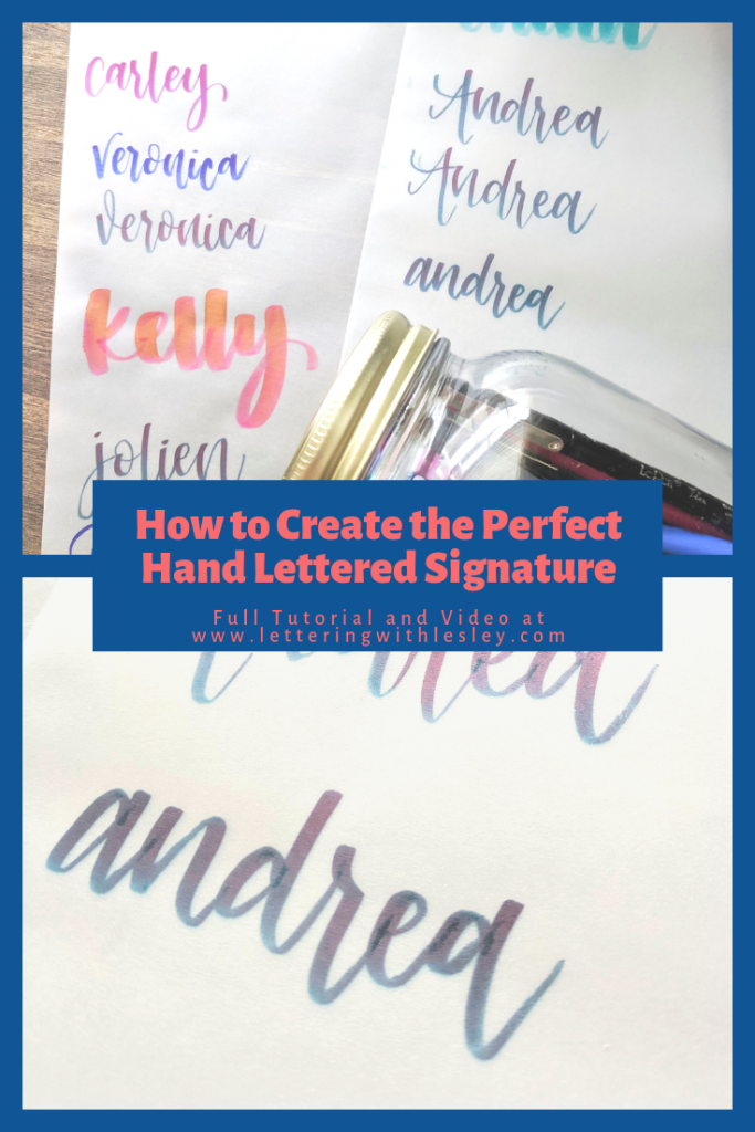
What you should see here is that your pen is looking a whole lot like your faux-lligraphy from earlier. If you are getting inconsistencies in thickness, you can definitely go back over the lines to even them out. With a lot of pens, you will get a little stripe down the middle of them from overlap. So, our goal is to not have to make second and third passes.
If you can’t tell a difference between your thick and thin lines, you probably need to lighten up your pressure. So, instead of thinking heavy down, spend your mental energy thinking about lifting up on your upstrokes. That sounded really pretentious and ridiculous as I typed it, but, instead of thinking about applying heavy pressure, think about keeping it light. If you are someone who writes with really heavy pressure normally, this tip is especially important for you!
And now for a moment with large nibbed pens… If you want to use a large nibbed brush pen (Tombow Dual Brush, Arteza Twimarkers, Zig Brushables, and the like), there are a few notes that you want to keep track of! First of all, you are going to want to write in pencil really large and really wide. The bigger the pen, the more operating room you need. When you create your downstrokes, again, make them super wide. You want to make sure that you have plenty of space. Also, while you letter, you may want to continue to scoot your tracing paper over . If one letter is wider than you planned in pen, you just move your paper at the next letter so you can continue to trace.
STEP 5:
I would really like to tell you that this is the perfect tutorial and that you have clearly mastered all these steps in five minutes. And, maybe, just maybe, this is so well written that you did! Hooray! But, for most of us, it takes a little bit of practice. Just a few minutes a day make a huge difference and you will see improvement in about two weeks. Hand lettering is mostly muscle memory with some flair and it just takes a little bit of time to develop.
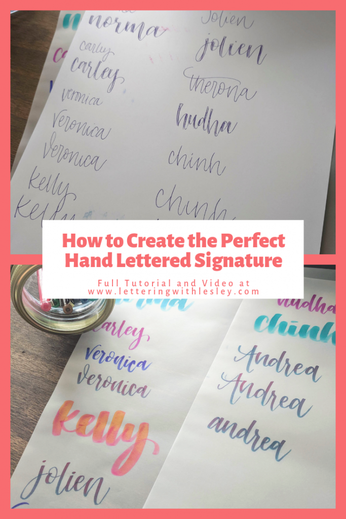
Below is a video tutorial that will take you through all the steps of the process for lots and lots of different names! I also have a tutorial that was live in my Facebook group! Come be a part of our lettering group.
Now, go get your letter on!